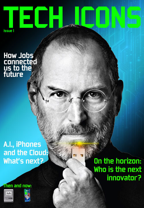
My first portfolio item is a fictional "Tech Icons" magzine cover featuring Steve Jobs. Admittedly a throwback magazine cover, this Photoshop effort used layering, silo'ing and gradient techniques to achieve the desired look. After searching for (free) images, I created a few rough layouts before deciding on a look I liked. Layers were arranged so that type segments were easily identified. Silo and masks were used for all of the images, especially around Jobs’ hand (to make it appear to be holding the USB cord). Original images were maintained. The background is achieved with a color fill (black) base layer, a blue gradient layer, and an overlaying grey radiant layer. A challenge was using the magnetic lasso tool to silo the hand.


After researching various electric vehicle logos, I decided to create a clean, simple, sharp vision for this fictional brand. I used the Photoshop type tool and borrowed a mountain-ridge shape from the Photoshop shapes library. A simple gradient was applied to the background mountains. I thought that the Sackers Gothic typeface contributed to a clean expression while not looking too cold and technical.
I rasterized the layers so that I could use the Free Transform tool to manipulate the size and copy the logo into other parts of this project.
For the LinkedIn banner, I checked online for workable dimensions (1584 pixels by 396 pixels). Again, I wanted to keep this clean and simple, so I downloaded the background image from Adobe Stock (after searching for “mountains and lightning”) and just set it at an opacity of 20% so the highlight is still the company logo.
Home

In this project I used symbols and key frames to create this mobile ad for my fictional company. For the car, home and motorcycle images, I established the order of appearance and then set the keyframes and timeline accordingly. Because these three images were converted to symbols, I was able to use the Color Effects option in Properties to set the Alpha to zero, creating a fade-in appearance as they moved onto the app stage.
I employed a similar effect the type features. By converting the text blocks to symbols, I was able to establish fade-in effects according to the timing I desired for the ad.
I also found that specifically naming each layer allowed me to keep track of what I was doing with timing and effects. I gave the stage a slight color for this website to better define the ad (the mobile ad has a white background).
Home
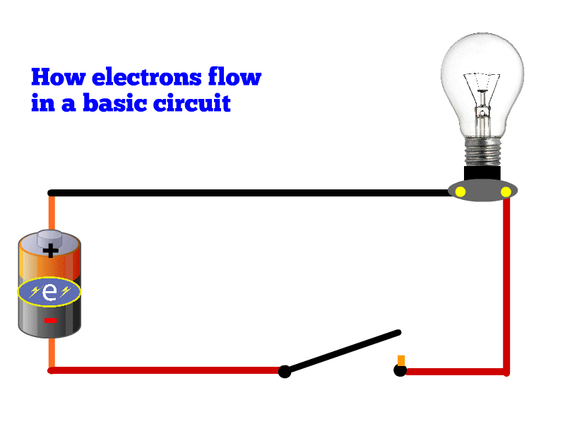
In this project I used key frames, timing and symbols to clearly display how electrons flow from a battery when a switch is closed to power a light bulb. The first step was laying out the simple wiring using the brush tool (holding down the shift key to ensure straight lines). I then searched for simple images of light bulbs and batteries that would fit with my basic schematic. For the switch and receptacle, I decided to use plain schematic drawings created in Animate. After trying a few different ways to represent electrons, I decided to create a basic Illustrator symbol and import that into my file. Once I had the layout done and elements in place, I established the timing of how the graphic would activate. I wanted the switch to close, the electrons to flow and the bulb to appear to light when reached by electrons. First, I established the timing of the switch, using a motion tween to “close” it. After that was set, I set the electron symbol in motion using key frames and classic tweens. To get the bulb to “light,” I timed the electron symbol’s arrival with the unlit bulb disappearing, using the Alpha slider in the light’s property menu. That way the lighted bulb (in the layer underneath) would appear. At the end of the electron route, back at the battery, I wanted the switch to return to the open position and the unlit bulb to reappear, so for those two layers I added additional key frames reflecting the open switch without lighting.
314 Henry St.
South Amboy, NJ 08879
732-887-4505; pdrodina@gmail.com
Experience:
Production Manager, Centennial Media, New York, NY (September 2017–February 2023)
• Tracked images and shipped pages for 6-to-10 single-issue magazines per week
on a
wide range of cultural, historical, health and food topics.
• Wrote PDFs of entire issues for editors and designers to review; shipped final PDFs.
• Placed retouched images and updated text in InDesign layouts.
• Resolved prepress issues with printer.
• Collaborated on production and shipping of hardcover books.
• Instructed and supervised two production associates.
• Retrieved archived issues for reprints.
• From November 2022 to February 2023, worked as part of a360media.
Production Editor, More magazine (Meredith Corp.), New York, NY
(December 2000-February 2016)
• Managed workflow between art and edit staffs. Flowed text into layouts; placed retouched
images; circulated printed stories for review by art and edit staffs.
• Tracked and organized images for color correction.
• Communicated with advertising production on magazine makeup and ad/edit placement.
• Organized digital archives of photographs and InDesign documents for each issue.
• Resolved production issues with prepress supplier and printer.
• Assigned and managed work of freelance copy editors and proofreaders.
• Created art/edit production schedules for the year.
Art Production Manager, Fitness magazine (Gruner+ Jahr), New York, NY (March 1999-December 2000)
Production Editor, Modern Bride magazine (Primedia), New York, NY (October 1989–March 1999)
Skills: Adobe Creative Suite (extensive InDesign, Photoshop, Acrobat), along with Woodwing for workflow management; Word, Excel
Education: Bachelor of Arts, History; Fordham University
Home