In looking at two websites that produce similar products in the same market (scale models for hobbyists), I see two very different approaches to the use of color.
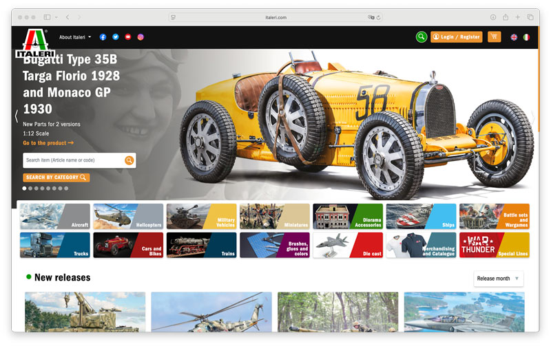
The website for Italeri, whose logo includes red, green, black and white, uses color throughout to highlight its different product lines. To my eye, Italeri’s use of analogous colors stemming from its company logo creates an integrated, inviting look. Color is used to organize the website, while not overtaking the box art exhibited for the various model lines.
Here's a look at the site's opening page:
Here's an example of a product page:
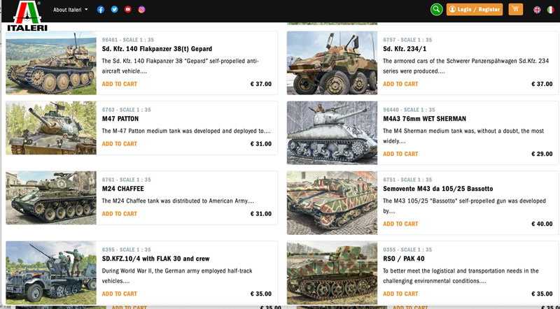
Although the products are the stars, I appreciate the color choices and use of gradients that direct a visitor to products, company information and customer support.
Here's the Italeri website information page:
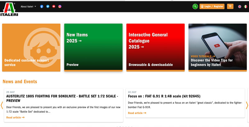
Overall, the Italeri website uses color to illuminate but not overshadow its product line.
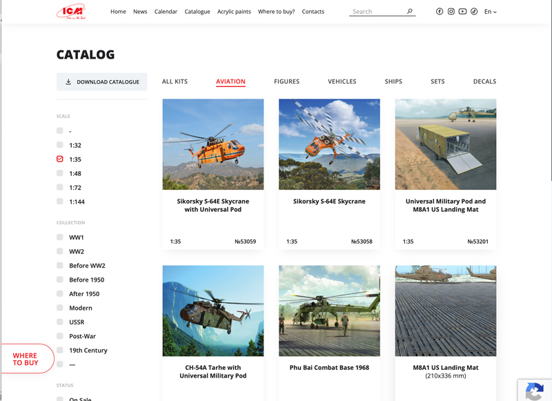
ICM, a Ukrainian manufacturer, while operating in the same market, uses a very different color approach on its website. The company logo is a simple red, and this clear simplicity carries throughout its website.
Here’s the opening page:
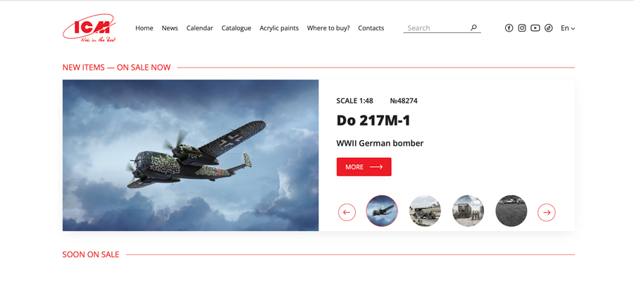
Red, black and white (space) are the only colors used. It is a very clean and organized look—the use of white space directs visitors to where they want to go with no confusion. While this website is stark compared to the Italeri site, I found it just as inviting. The logo-red provides a steady color theme through; the white space provides an ideal backdrop for the dynamic box art of their kits.
Here's a sample of an ICM product page: